
Welcome to the New Oak Cliff Brewing Co.


Last September, Oak Cliff Brewing Company entered a new phase of growth with the launch of our full-scale production brewery and taproom. As we continue this pattern of growth– expanding into markets throughout DFW and offering a broader selection of fresh beers–we wanted our brand to reflect our people and the unique culture of Oak Cliff. We also wanted it to fit our future.
Earlier this year, we began the process of refreshing our brand. Today we’re pleased to announce that the overall refreshed brand contains an updated logo, a new strategic vision for the growth of the brand, and clearer messaging. This refresh represents both an evolution of our internal culture, as well as our interpretation of the Oak Cliff community around us.
We were able to catch up with graphic designer, illustrator, and our neighbor here at Tyler Station, Jeff Rogers, who tackled this project to better explain how this branding process developed over time:
Was there anything that you wanted to carry over, in terms of brand identity?
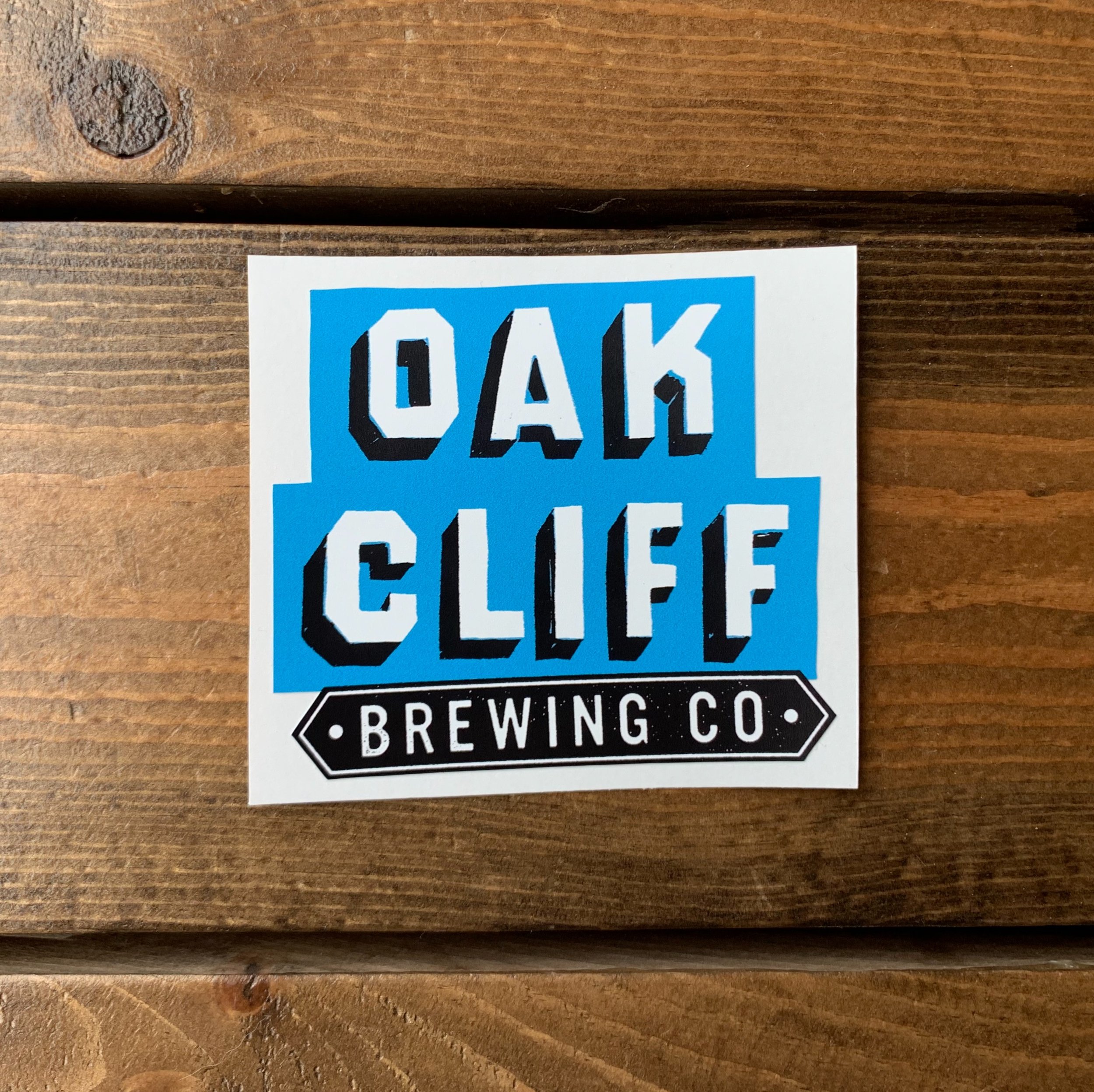
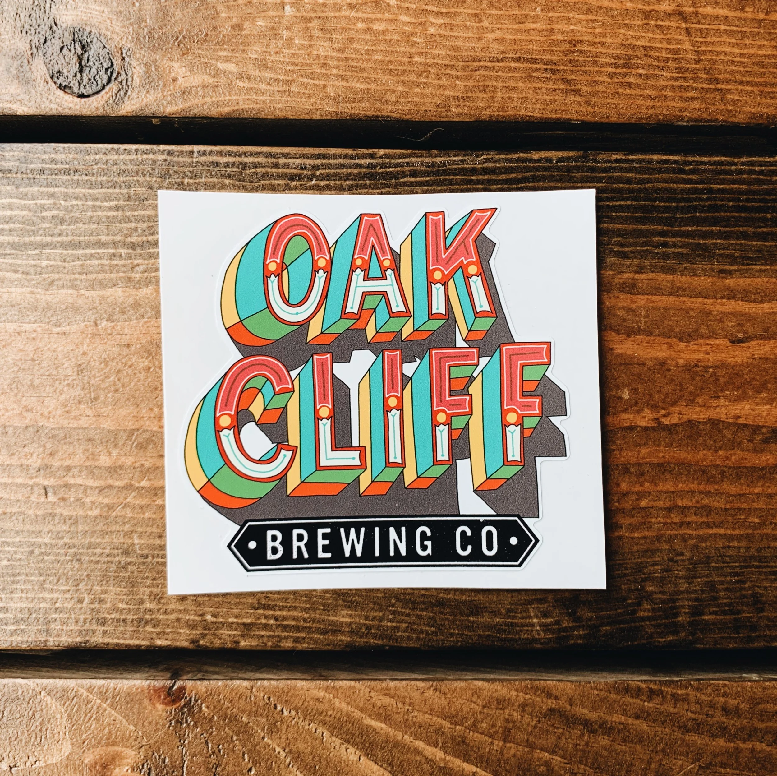
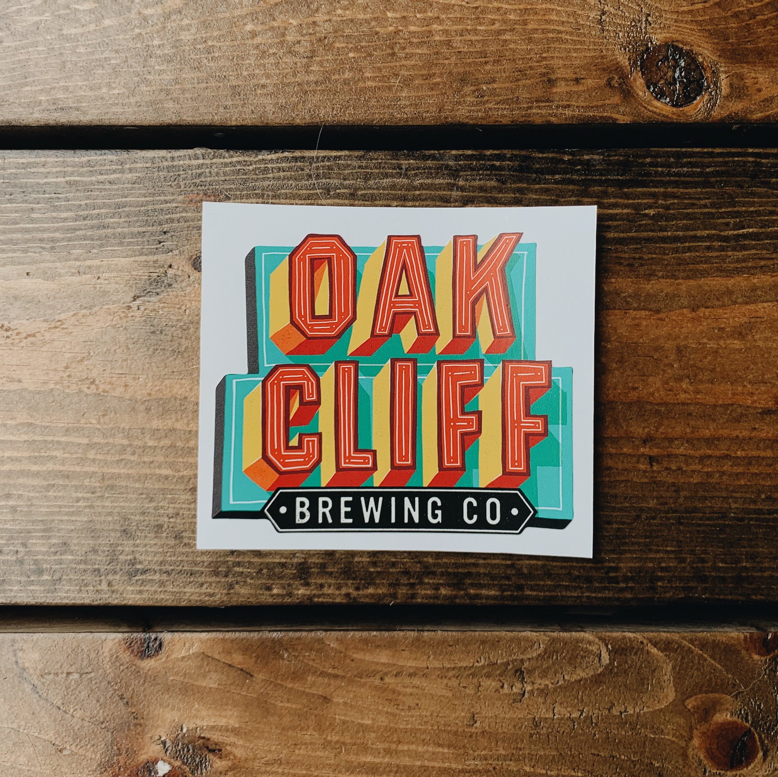
“It seemed like we all enjoyed the vibe that the paintings in the tap room have so I wanted to keep traveling down that path with the new branding. One small thing we kept was the angular sans serif style of "Brewing Co." in the previous logo. We used this style in some of the letters in the taproom and on the exterior of the building. But mostly it was the hand-made quality and variety that I wanted to keep riffing on.”

Talk us through the design process and the moment(s) that the new brand 'clicked' in your head…
“It was very helpful to be so familiar with the brewery before starting the process. It's like the ideal way to start a branding project, just to be SUPER familiar with the organization and what it's all about. In this case it was super helpful to get to know Joel and his vision for the brewery, his deep connection to the neighborhood and the clientele demographic, which is mainly people who live in Oak Cliff. There is a strong neighborhood pride and that is a great story to latch onto when thinking about branding. It is already there. You don't have to try and invent it. My initial thought was that the words "OAK CLIFF" were the brand hero.
It's all about community and this neighborhood. We wanted to establish the brewery as a staple in the neighborhood. It would be great if when people heard the words "Oak Cliff" they thought of the brewery. The neighborhood is so diverse and arts focused, it seemed silly to limit the visual elements of the brand to just a logo. OAK CLIFF can look like anything. The more variety the better. That is the story of this neighborhood and we're tapping into that with the branding.”


How do you see the new brand developing over time? Where do you think it will be in ten or twenty years?
“I would love to see this strategy evolve into the creation of a giant body of visual work that, when seen all together, expresses feelings of community, diversity, collaboration, craft, excellence and most importantly, fun! Also, I just hope the taproom continues to grow more and more into a staple in the community as a space where families can come play games while sitting next to creative people in the community hashing out ideas and making new friends. I personally have met several new people in the brewery which has led to hopefully will someday lead to future collaborations. I love that. I would love to hear phrases like, "it all started with that conversation at oak cliff brewing." I hope that the branding can help to amplify that kind of culture as it evolves.”
Talk us through when the team committed to tethering the entire brand to ‘Oak Cliff’ - was it freeing? Was there some vulnerability with that?
“I think it just made the most sense honestly. It's always better to build off of the foundation of a good idea instead of just trying to make a cool looking thing, you know? That's easy. Anyone can make a cool thing. The idea made sense and the hard part was making visual work that lived up to the idea and did its job, which I think it does pretty well and there is room to continue to evolve and improve as we go.”
How does the new brand better embody OC and what it's all about?
“Leaving room for OAK CLIFF to have an almost unlimited amount of variations allows the brand to express the thing that makes this neighborhood so special: diversity, community and creativity.”


The Oak Cliff Brewing Company (and the delicious beer!) you know and love isn’t disappearing. We are doing a better job of telling our story and, most importantly, the story of Oak Cliff.
This is something we plan to do for many years to come.


Illustrator: Jeff Rogers